
Chess is the psychological warfare between two intellectual minds
Type:
Motion Branding
Year:
2020
This project presents a new identity system for Chess.com that capitalizes on the players’ competitive spirit and energy to reframe the brand as the most ambitious platform for chess playability. Bold graphics and typography are inspired by the gestures and notations of the game.
Motion Branding
Year:
2020
Chess.com Identity
This project presents a new identity system for Chess.com that capitalizes on the players’ competitive spirit and energy to reframe the brand as the most ambitious platform for chess playability. Bold graphics and typography are inspired by the gestures and notations of the game.
I like the moment when I break a man’s ego
—Bobby Fischer

Role:
Individual Project
Credits:
Elaine Alderette (Instructor)
Individual Project
Credits:
Elaine Alderette (Instructor)
Background:
Chess.com is the most visited board game community website where players learn, read, watch and play chess online. However, due to their overpopulated community and contents, the brand became a jack of all trades but a master of none, allowing the competitors to specialize in playability, competitiveness and learning.
To once again present Chess.com as the state-of-the-art platform that makes chess exciting, I looked into the mindset of the players —the desire to outsmart their opponent— and created an identity system that revolves around it. The target audiences are intermediate office workers around 30 to 40 who enjoy playing chess in their free time through the phone or with co-workers and want to get better.
Software:
Cinema 4D
After Effects
Premiere Pro
Photoshop
Illustrator
XD
Cinema 4D
After Effects
Premiere Pro
Photoshop
Illustrator
XD
Logo Development
The C-shaped logo was constructed using an isometric grid, inspired by an angled chess board in different perspectives to achieve a dynamic feeling.
The brand’s original color palette successfully distinguishes itself from the competitors, so the new identity also uses that strategy but adjusts the tone of the green to reflect the boldness of the players and add a tint of gold to give a more premium aesthetic.


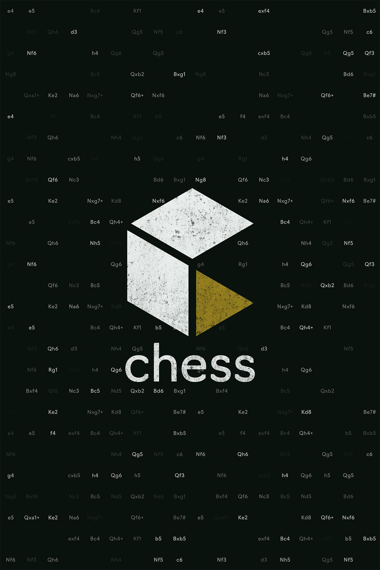
Graphic Elements
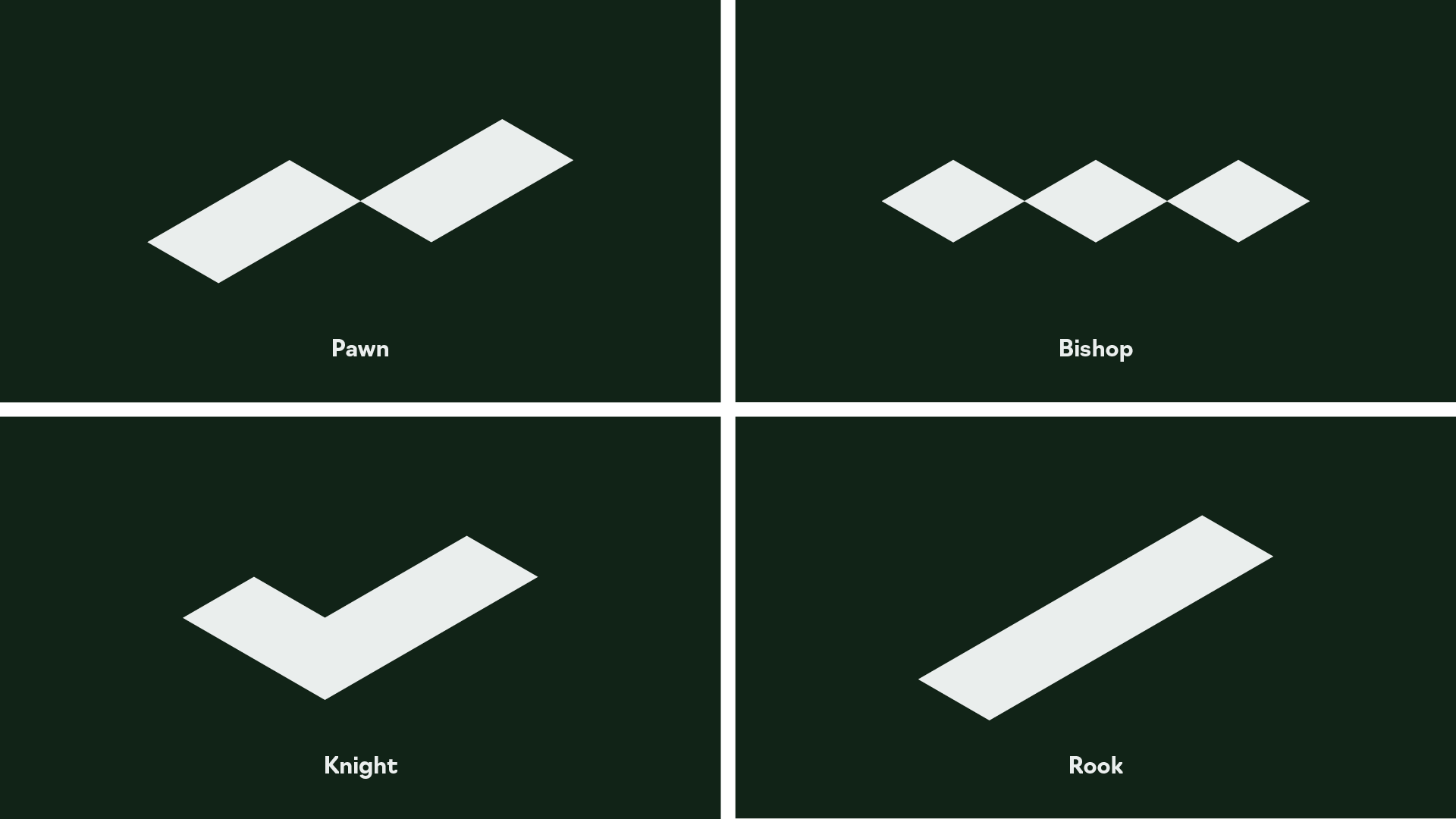
The chess icons are designed on an isometric grid like the logo, but the shape is based on the standard chess set used for competitive matches to distinguish each piece in fast playing blitz matches.
The graphic elements such as the bold lines and numerical textures are inspired by the pieces’ square gestures and the chess notations that players document during their game.


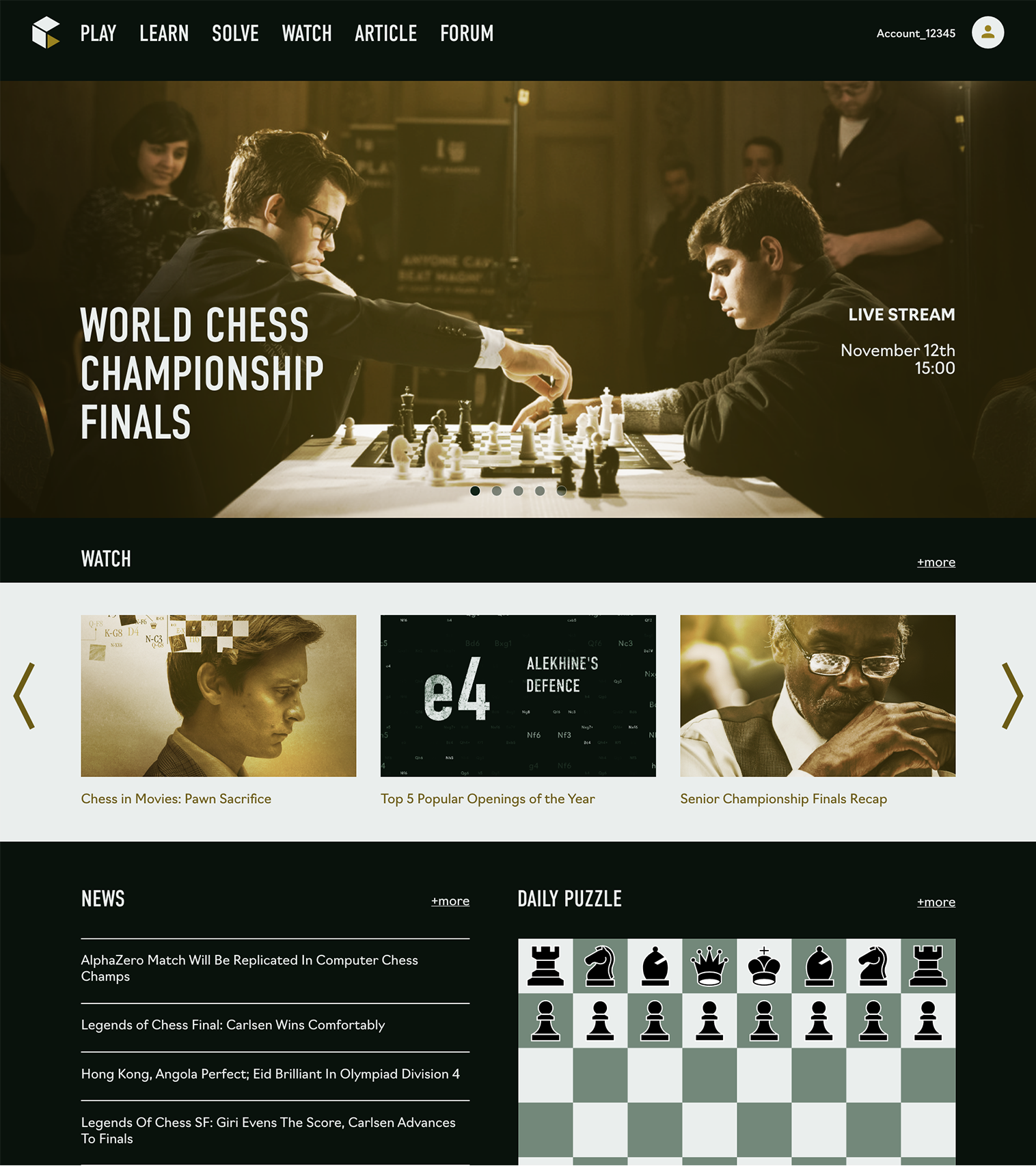
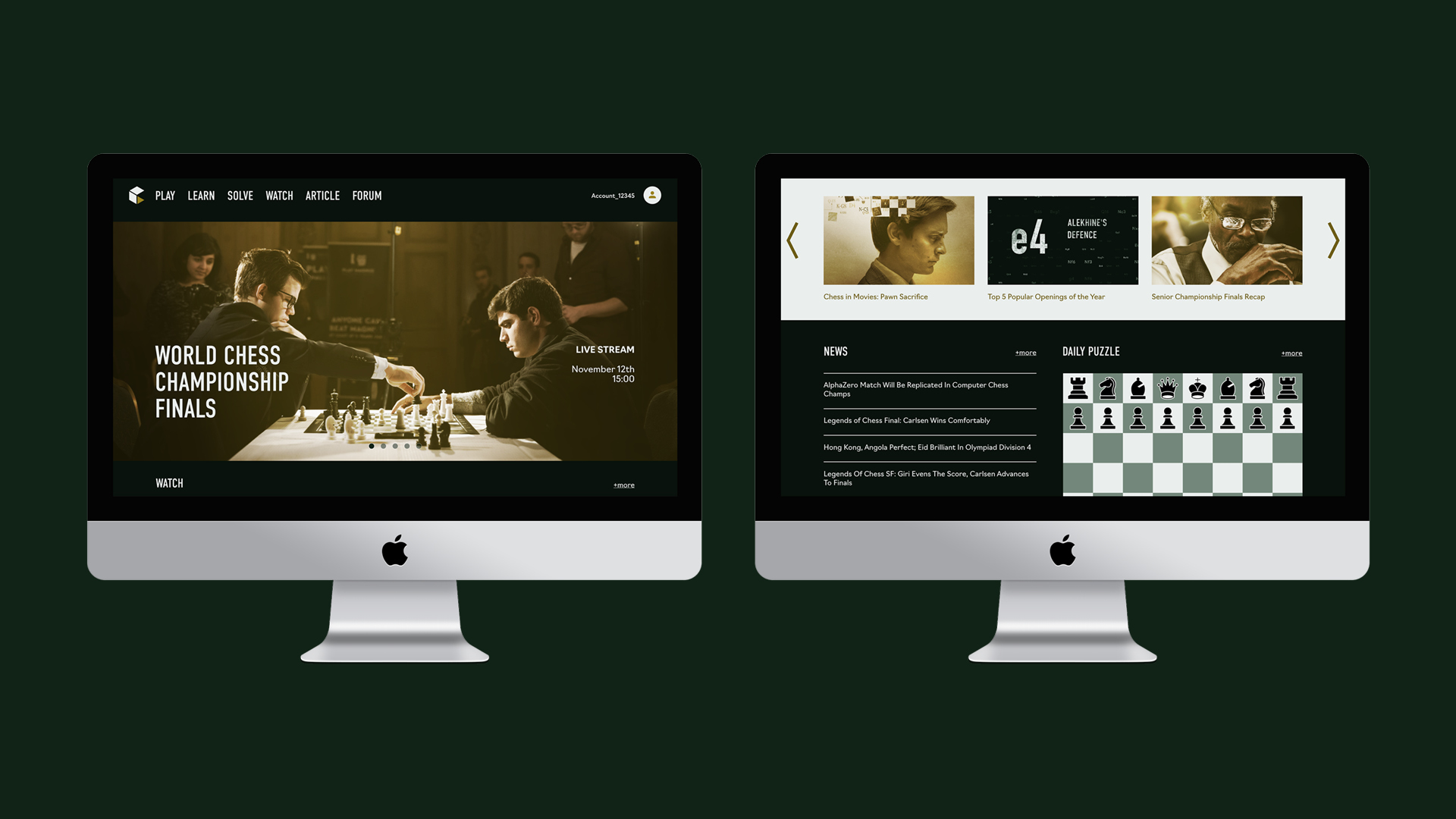
Website
To revamp the digital presence of Chess.com, I redesigned the interface for the website and application using the new identity system.
To revamp the digital presence of Chess.com, I redesigned the interface for the website and application using the new identity system.

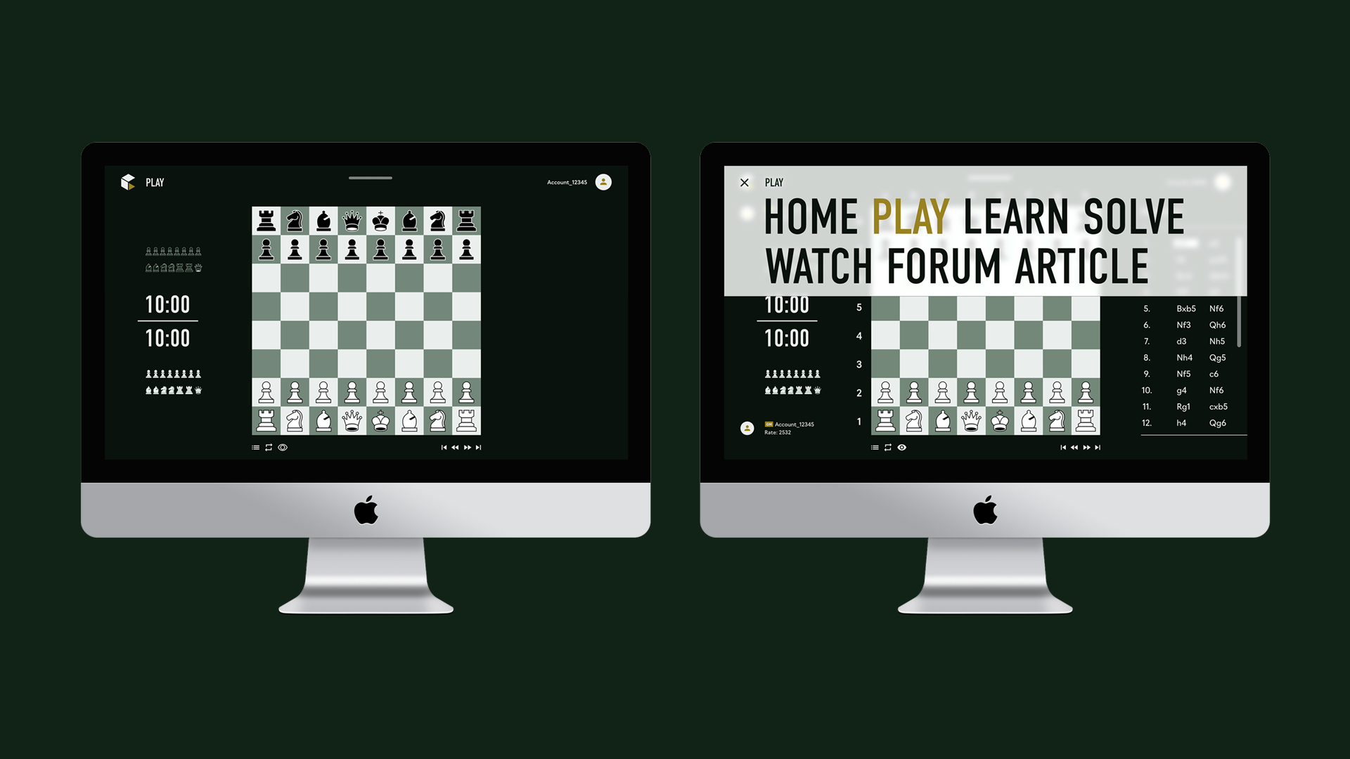
Mobile Application
To enhance the game’s playability closer to the physical experience, I included a focus mode feature on the browser and mobile game screen, which allows the interface to eliminate unnecessary information and show only the chess pieces and timer, allowing players to focus on their moves.
To enhance the game’s playability closer to the physical experience, I included a focus mode feature on the browser and mobile game screen, which allows the interface to eliminate unnecessary information and show only the chess pieces and timer, allowing players to focus on their moves.


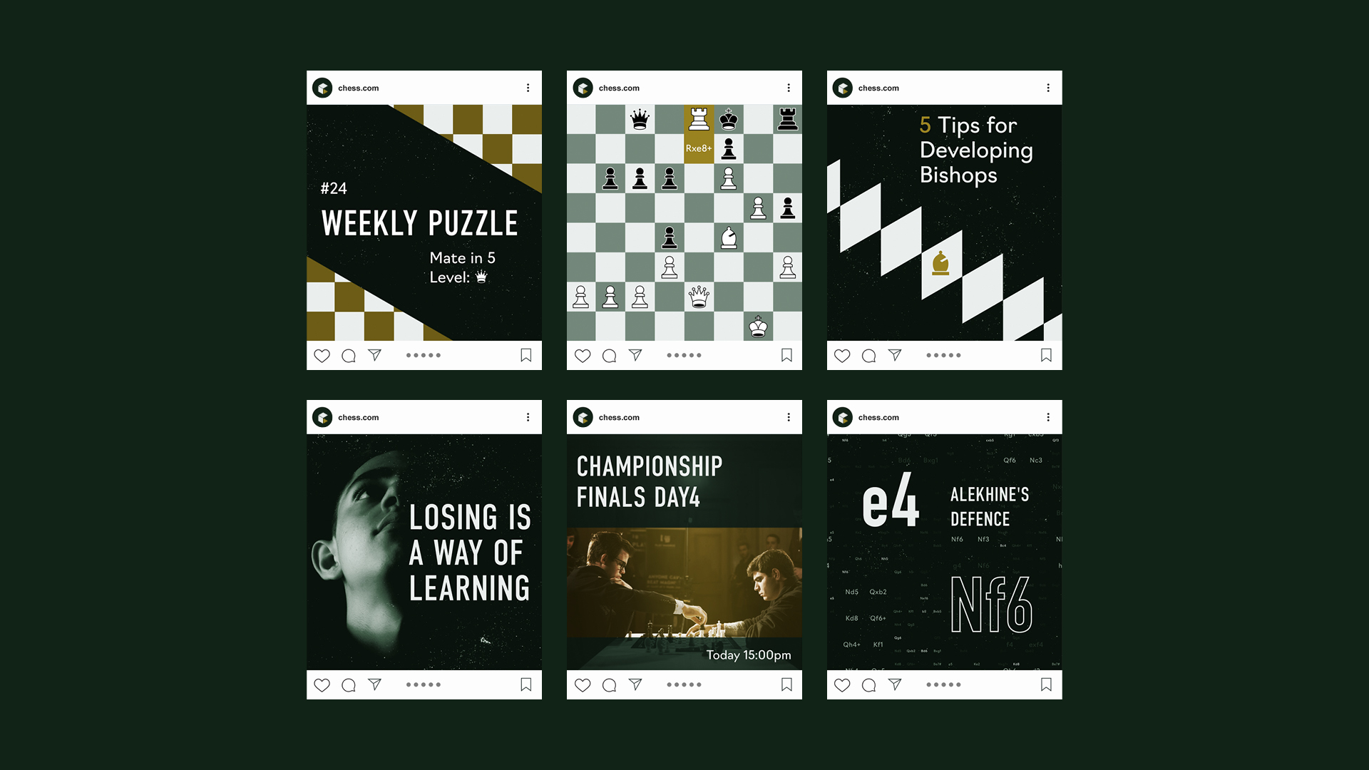
Social Network
I also used Instagram as the primary source for social media, where the brand can visually share tips, strategies, quotes, and upcoming live shows or tournaments, allowing the players to learn more about chess more casually outside the game.
I also used Instagram as the primary source for social media, where the brand can visually share tips, strategies, quotes, and upcoming live shows or tournaments, allowing the players to learn more about chess more casually outside the game.


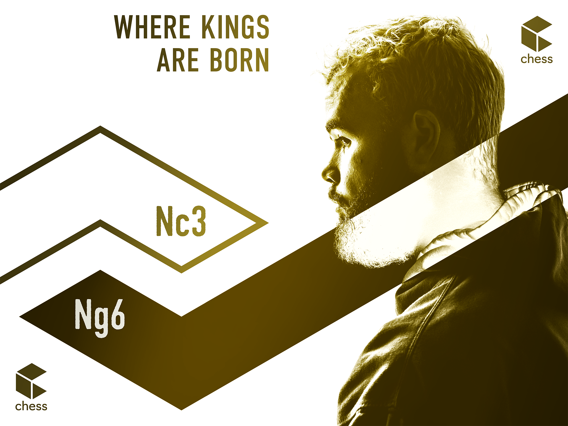
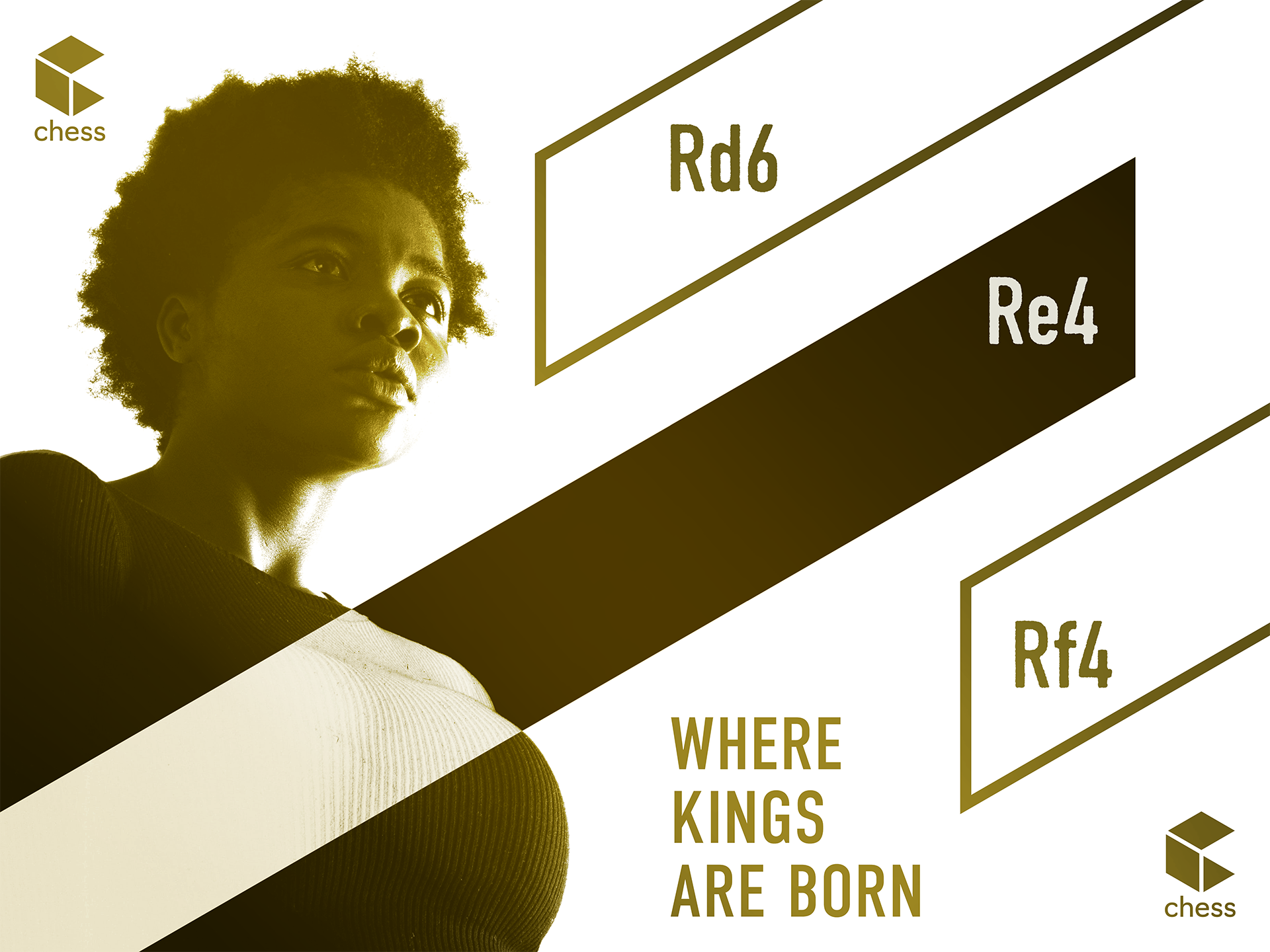
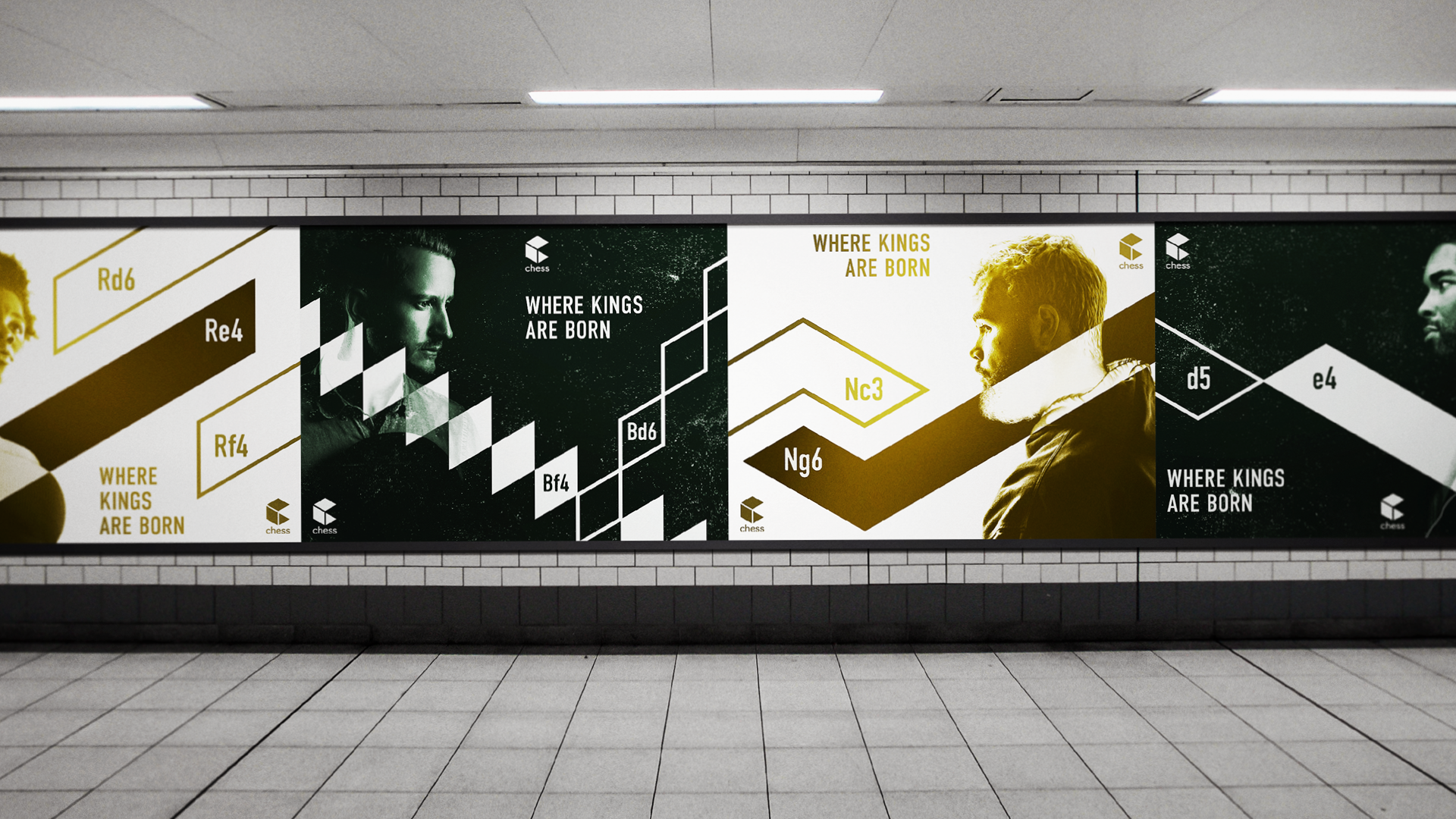
Brand Poster
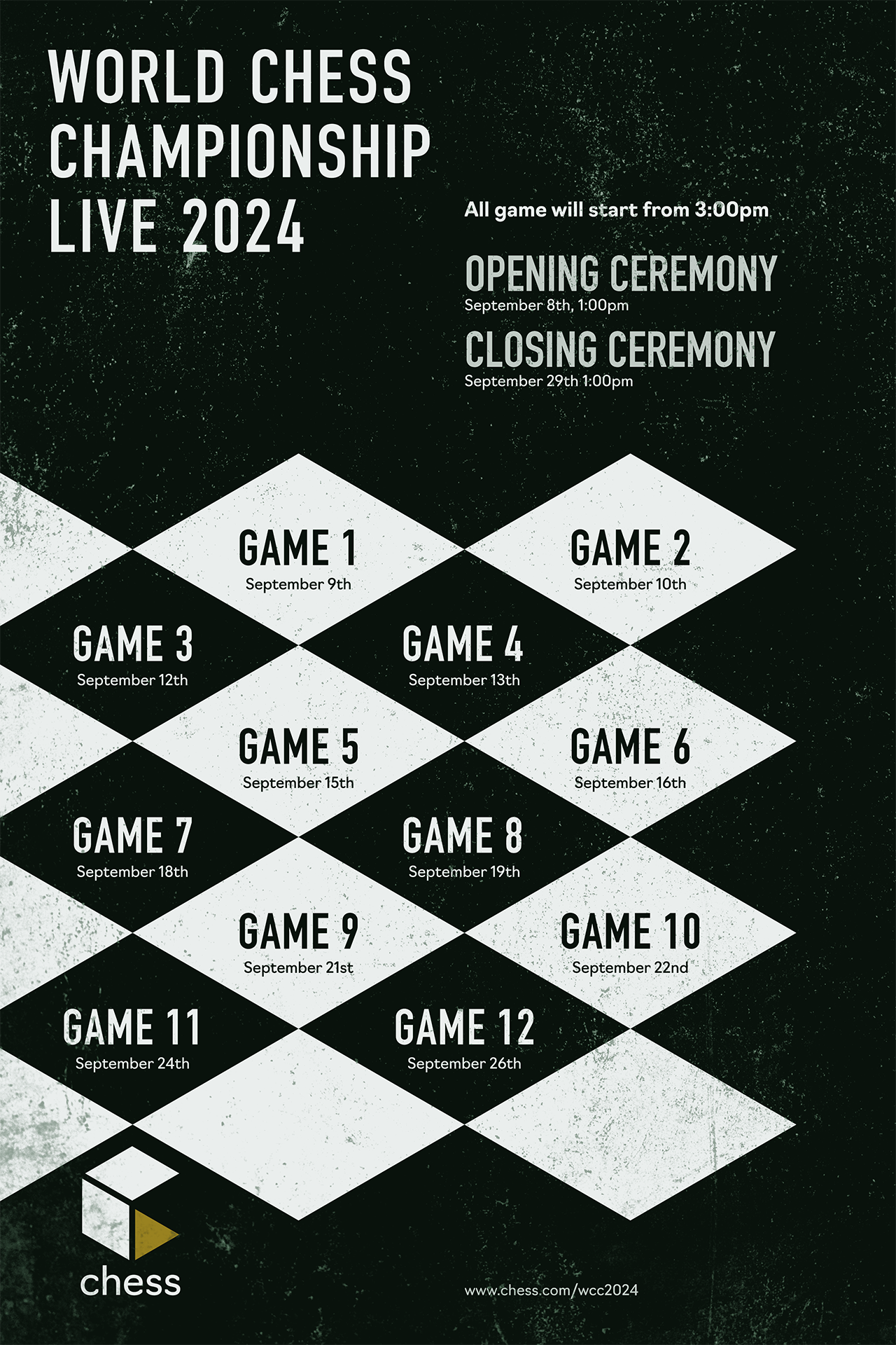


Sequential Poster


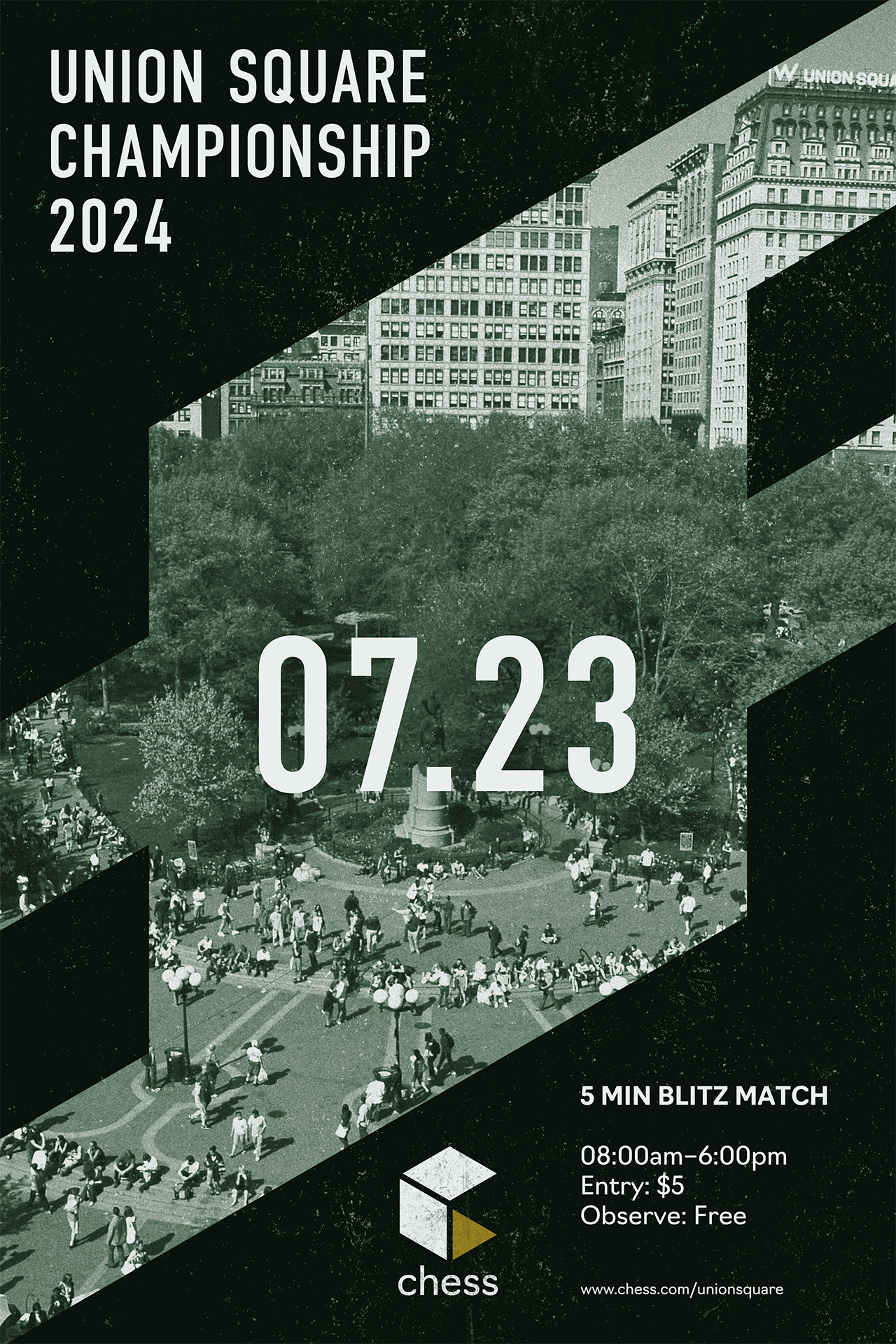
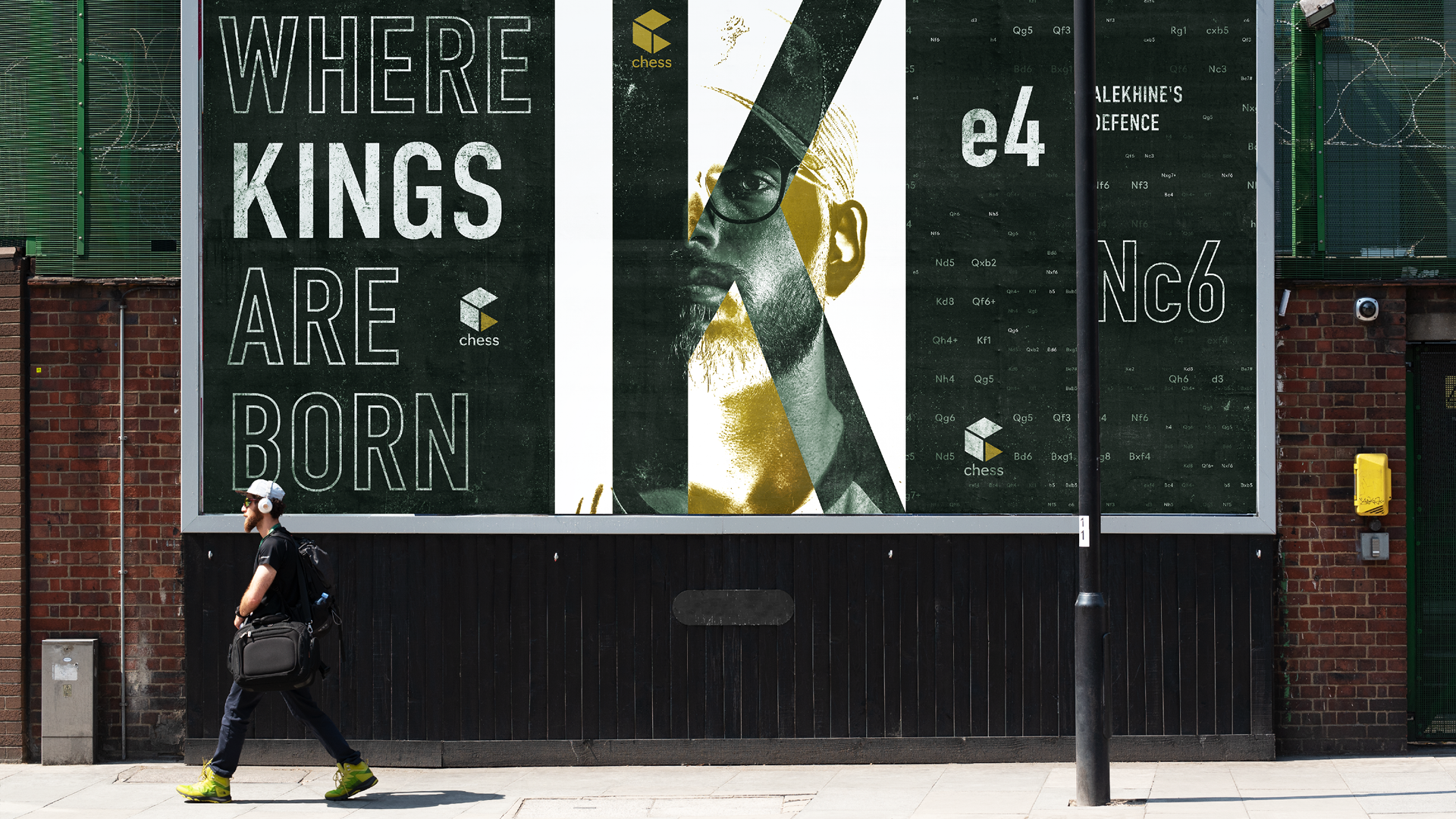
Outdoor
The posters are mainly posted on public areas such as bus stops, parks and train stations so users can casually access the website while they are waiting. They are also posted on traffic-heavy streets, reflecting the movement of the pieces to the moving vehicles.
The posters are mainly posted on public areas such as bus stops, parks and train stations so users can casually access the website while they are waiting. They are also posted on traffic-heavy streets, reflecting the movement of the pieces to the moving vehicles.
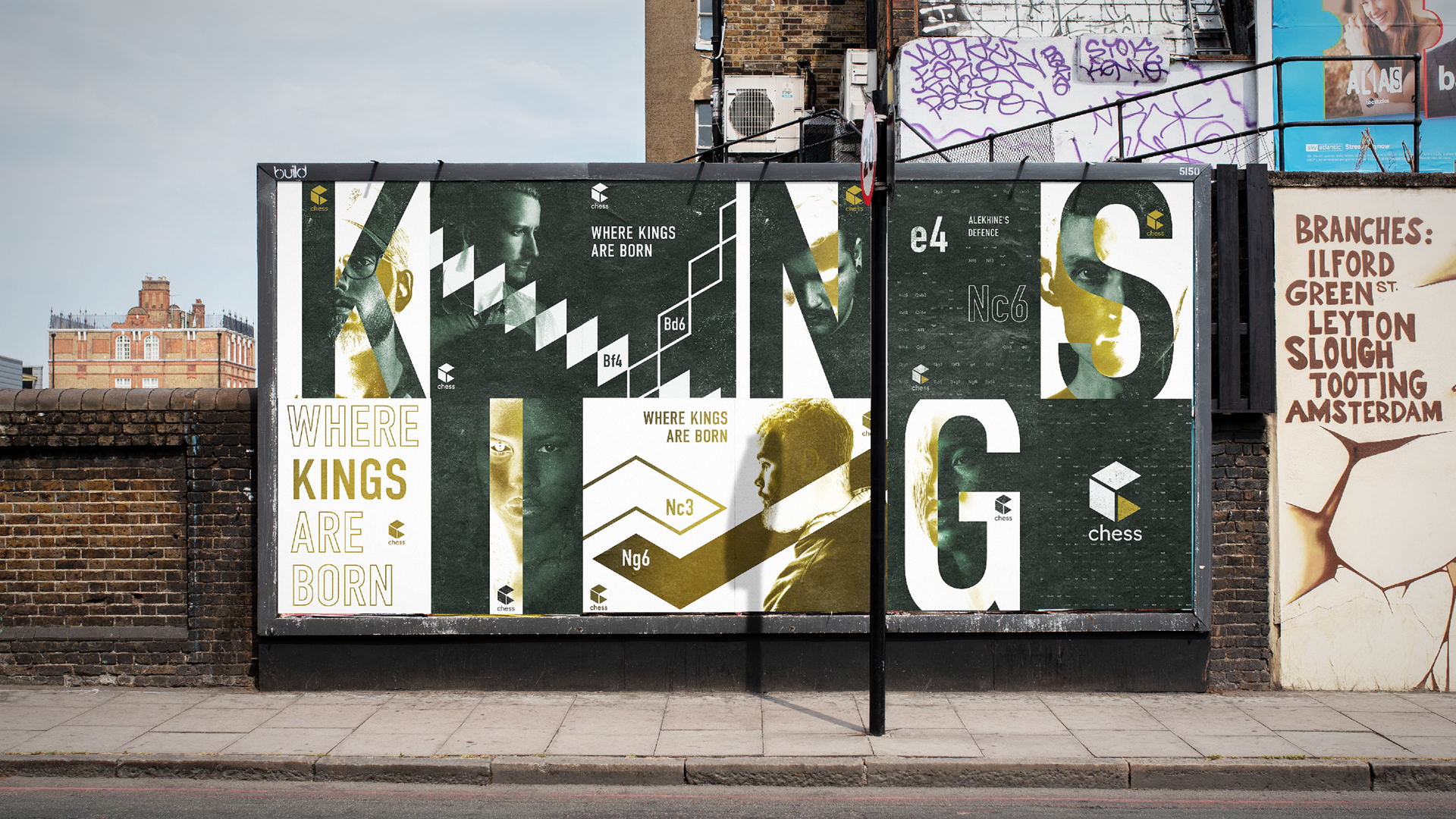

Mural
The mural celebrates the upcoming chess tournament that will be held at union square, the hot spot for chess hustlers. The green lines on the tiles represent the movement of the chess pieces into a human scale.
The mural celebrates the upcoming chess tournament that will be held at union square, the hot spot for chess hustlers. The green lines on the tiles represent the movement of the chess pieces into a human scale.
